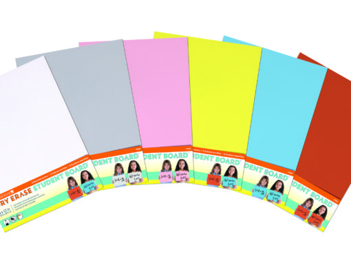
Crescent Dry Erase Student Board
The Objective: Branding and packaging for Crescent’s new line of Dry Erase Student Boards.
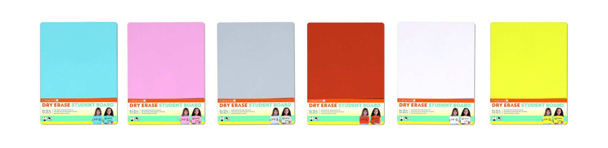
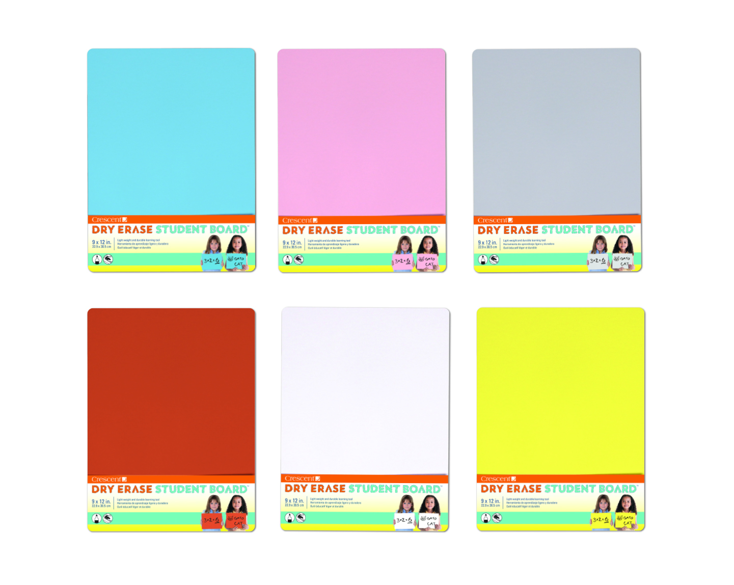
The CDC Solution: The CDC design team used a friendly and easy to read font with a hand colored effect to mimic the product use. For the package labels, we included photos of young students demonstrating the product to quickly convey to parents and educators how the product is used. A fresh and friendly palette was selected to complement the full line of colors. Icons were used to convey the media that can be used on the product.
The Results: The product has been picked up by distrubutors and educational retailers.
DRY ERASE STUDENT BOARD VIDEO
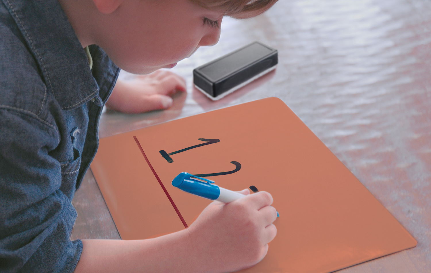
The Dry Erase Student Board makes leaning more fun and in the video we used kid friendly and playful images to quickly tell the Dry Erase Student Board story. We integrated hand drawn graphics and text to emphasis the product uses and benefits in a quick 30 seconds.
DRY ERASE STUDENT BOARD VIDEO
The Dry Erase Student Board makes leaning more fun and in the video we used kid friendly and playful images to quickly tell the Dry Erase Student Board story. We integrated hand drawn graphics and text to emphasis the product uses and benefits in a quick 30 seconds.
DRY ERASE STUDENT BOARD VIDEO
The Dry Erase Student Board makes leaning more fun and in the video we used kid friendly and playful images to quickly tell the Dry Erase Student Board story. We integrated hand drawn graphics and text to emphasis the product uses and benefits in a quick 30 seconds.
DRY ERASE STUDENT BOARD BRANDING
The CDC design team used a friendly and easy to read font with a hand colored affect to mimic the product use. A fresh and friendly palette was selected to complement the full line of colors.
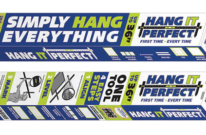
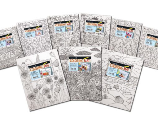
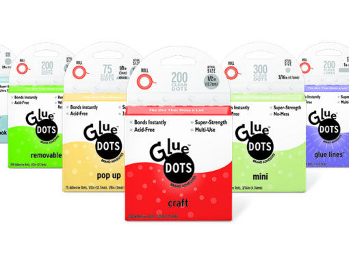
OTHER PACKAGING EXAMPLES